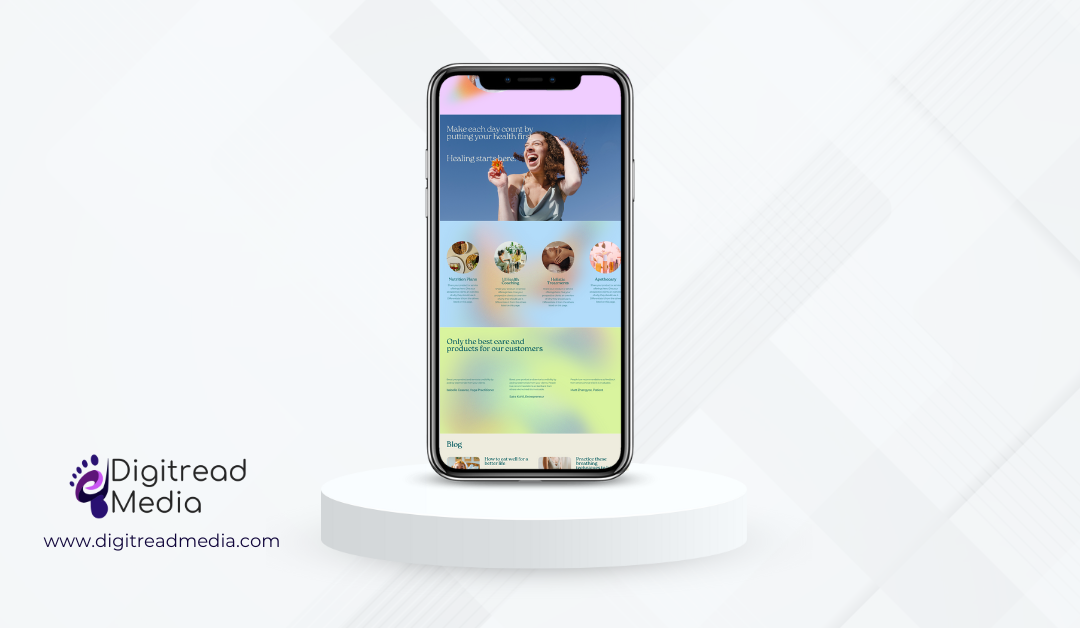
In today’s mobile-centric world, smartphones have become ubiquitous and are an integral part of our daily lives. Having a website that looks good and functions seamlessly on mobile devices is no longer just a luxury—it’s a necessity. Mobile-friendly design, also known as responsive design, ensures that your website adapts to various screen sizes and resolutions, providing users with an optimal viewing and browsing experience regardless of the device they’re using. From improved user experience to better search engine rankings, prioritizing mobile-friendly design is crucial for the success of your website.
The Rise of Mobile Users
Over the past decade, there has been a significant shift in internet usage patterns. Mobile devices, especially smartphones, have become the preferred choice for accessing the internet. According to various studies, a substantial percentage of online traffic comes from mobile users. This trend is only expected to grow in the future. Ignoring mobile users means missing out on a substantial portion of potential visitors and customers. A mobile-friendly website ensures that you can effectively reach and engage with mobile users, thereby maximizing your online visibility and opportunities for conversion. Therefore, it is essential for website owners to adapt to this change by ensuring their websites are designed with mobile users in mind.
Enhanced User Experience (UX)
User experience plays a pivotal role in determining the success of a website. A mobile-friendly design enhances the overall user experience, making it easier for visitors to navigate through your website on their smartphones. Mobile-optimized websites are responsive, adjusting to various screen sizes and resolutions. This adaptability ensures that users can effortlessly browse, scroll, and interact with the content, resulting in a positive experience. A positive user experience not only keeps visitors engaged but also encourages them to stay longer and explore more of what your website has to offer.
Improved SEO Performance
Search engines like Google prioritize mobile-friendly websites in their search results, especially for users searching on mobile devices. In 2015, Google introduced mobile-friendliness as a ranking factor, meaning that websites optimized for mobile are more likely to rank higher in mobile search results compared to non-mobile-friendly sites. Additionally, Google has transitioned to mobile-first indexing, where it predominantly uses the mobile version of a website’s content for indexing and ranking. This emphasis on mobile optimization underscores the importance of ensuring your website meets the criteria for mobile compatibility to maintain or improve your search visibility and attract organic traffic. Having a mobile-friendly design not only enhances user experience but also boosts your website’s visibility and ranking in search engine results pages (SERPs).
Increased Accessibility
Mobile-friendly design promotes accessibility, ensuring that your website is accessible to a broader audience. With a growing number of people relying solely on their smartphones for internet access, a mobile-friendly website caters to users who may not have access to traditional desktop computers. By embracing mobile optimization, you make your content available to a diverse range of users, including those in regions with limited access to desktop computers or those on the go.
Lower Bounce Rates
A website that is not mobile-friendly often experiences higher bounce rates, as mobile users quickly abandon pages that are difficult to navigate or read on their devices. Bounce rate refers to the percentage of visitors who leave a website after viewing only one page. By ensuring that your website is responsive and optimized for mobile devices, you can reduce bounce rates and encourage visitors to explore multiple pages, thus increasing the likelihood of conversions, whether it’s making a purchase, signing up for a newsletter, or contacting your business.
Enhanced Conversions
A mobile-friendly website isn’t just about attracting visitors; it’s also about converting them into customers or leads. When users can easily access and navigate your site on their mobile devices, they are more likely to engage with your content, explore your products or services, and complete desired actions, such as making a purchase or filling out a contact form. By optimizing your site for mobile, you create a frictionless path to conversion, maximizing the effectiveness of your online marketing efforts and driving business growth.
Competitive Advantage
In today’s competitive digital landscape, standing out is crucial. A mobile-friendly website gives you a competitive advantage by demonstrating your commitment to providing a modern and convenient user experience. Visitors are more likely to engage with and trust a website that is easy to use on their mobile devices. In contrast, a website that is not optimized for mobile may drive potential customers away, leading to missed opportunities and potential business losses.
The importance of mobile-friendly design cannot be overstated in today’s digital era. With the majority of internet users accessing content on their smartphones, it is imperative for websites to prioritize mobile optimization. A mobile-friendly design not only enhances the user experience, boosts SEO efforts, and increases accessibility but also gives businesses a competitive edge in the online marketplace. By recognizing the significance of mobile-friendly design, website owners can ensure their online presence remains relevant, engaging, and accessible to a diverse audience.